
My media product conforms the convection's of a real magazine cover because of the bold masthead which indicates the title of the magazine, the masthead is also in an convectional place situated in the left corner because you can see it clearly and is similar to the 'Q' masthead and 'NME' which is wear i got some of my ideas from for the front cover of my music magazine. There is also sell lines an Paul quotes on my front cover which are in bold and some are which in quotation marks to attract the readers attention so they would want to read about more of the story with the main image situated next to one of my sell lines to indicate that it is the main story in the magazine. The main image has a prop of a trophy which also suggests what the main story is about. Also on my front cover i chose to have one subsidiary image because i felt that my main image was big and to many subsidiary images would clutter the page. My subsidiary image also had title to suggest what the story was about of the people in the image. Also to make my front cover look more professional i decided to put a banner on the bottom of the magazine along side with an issue date and a bar code.
Here are some music magazine front covers that i based my ideas from:

From this music magazine i have used the similar idea of the award badge and the banner, and i have focused on using a colour scheme of pink, yellow and white.
 From this music magazine i have chose to use the similar style of only having one person as my main image as i think i stands out more.
 Double page spread

My double page spread consisted one page with a big main image and another page with writing. This is what i chose from looking at other double page spreads from music magazines. Again my colour scheme is consent through out my product and I have used Paul quotes which will attracts the reader to the most interesting part of the story. I also put page numbers and a website on the bottom of the page to add the finishing touch.
Here is a double page spread that inspired me:
 From this double page spread i chose to show questions like this one did to make it look more professional and realistic as though i had met the person and interviewed them. I liked the lay out of this double spread because its unusual.
 Contents page
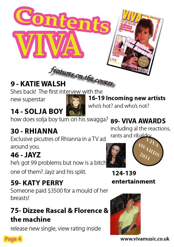
I thought i would make my contents page as conventional as possible, i used inspirations from 'Q' magazine, from writing the page number and the title with some detail underneath. I chose to put the front cover image in the right hand top corner to show that the front page matchs the contents page, i added small images as there was not much room to add big ones and at the end added again the page number and a website to make it look offical. However i didnt feel the need to make my contents page into a double page spread because i thought they looked better on one page and all the writing was in the right place.
Here are some contents pages that i got my ideas from:


No comments:
Post a Comment